About Me
- Lou
- Sydney, NSW, Australia
- I'm an arts management worker/ artist/ designer. I work at Accessible Arts in administration and bookkeeping, but also work on various freelance activities from photography to graphic design. I'm Associate Partner at the ARI, the Big Fag Press, board member of Runway Australian Experimental Art and occasionally work at Bailey and Yang Consultants. My creative work has often been driven by social issues and commentary. This blog started as a way of documenting research for my honours year at uni, which I have continued, in order to gather inspiration for future artistic practice.
Showing posts with label art. Show all posts
Showing posts with label art. Show all posts
Monday, March 10, 2014
Audio available - Accessible Arts Supported Studio Network Forum
The audio from Supported Studio Networks: Possibility and Potential has just been released. If you want to read a previous blog post about the project, see this previous post of mine.
Artist John Demos and I are panellists at the beginning of this one, Building Culture, but you can find the rest of the audios on the Accessible Arts site.
Saturday, September 7, 2013
Accessible Arts Disability Training Day
Yesterday courtesy of the Big Fag (thanks guys!), I attended a course on disability training at Accessible Arts run by Amanda Tink.
This was instigated by my project with John Demos, who's been doing a residency with our Press, funded by Arts NSW and administered by Accessible Arts.
There were quite a few things I learnt that I didn't know before. I generally treat everyone around me with respect, but when it comes a person with a disability, it's important to understand life from their perspective and make sure you know what phrases to use and how to approach them.
The section on stereotypes was one I was already very familiar with, but the section on communication was an important one for me. The difference, for example, between saying to a person who uses a wheelchair "do you need some help?" and "would you like some help?" is a good example because the idea of need perhaps takes away a little of their feelings of independence. That said, a person with a disability is not necessarily always in need of help - and they probably get asked that question about 10 times a day.
There's also many disabilities that are invisible. In fact, 1 in 5 Australians identify with having a disability, but the most prominent kinds of disabilities are psychological or health related. These people may find it difficult in work places as to whether or not to disclose their disability. Disclosure may mean they for example, would not prevail in a job interview. However should they not disclose, their disability may cause them difficulty at work.
Amanda played us this amazing video from the UK Disability Rights Commission: (you can find the second part on YouTube)
Language was also a key factor of the training session. Personally, I would never use words like spastic or retard, but I wasn't aware that perhaps a word like "handicapped" might cause offence. The best way to refer to people with impairments is to first regard them as a person, and to not assume anything about their life. So for example, you should say a "person with cerebral palsy" not "he suffers from cerebral palsy". You should not say "the deaf man", you should say "person who is deaf/ hearing impaired". And generally, it's better to find out a person's name! Also never talk about them as if they are not present, obviously. There's also things like being honest if you haven't understood what a person has said, and knowing the difference between simple language and moderate speed as opposed to talking to someone as if they were a child.
One thing that came up was how some people who are deaf sometimes don't consider themselves to have an impairment at all. Rather, that their ability to use sign language simply places them in a separate linguistic culture, one which has been extensively developed. I didn't know that before.
50 years ago being left handed was considered something of a disability. 20 years ago being gay meant you had a psychiatric condition. It's the society and world that shifts. It was interesting to look at how society has treated the issue of disability over time, beginning with a religious perspective that a person with an impairment must be so because he had sinned, or his family had sinned. Then from a medical perspective we would do the best for a person we could medically, and then they would just have to do the best they could to try and integrate within their family and get by.
The current model stemmed from the UK in the 70's where we think of people who have an impairment as not them being disabled, but rather than society itself is disabling them because of all the barriers they face, taking a wheelchair up stairs, or trying to find a cinema session that has audio captions.
Not many organisations have Disability Action Plans - only about 40% of arts organisations in Australia. It's important to understand that it's not a matter of building a ramp and hanging some audio tour headphones on the walls, it's about creating an environment that is entirely welcoming and not hostile through a range of means, both physical and emotional, and then, making the community of people with disabilities aware of those changes.
Anyway, I learnt a lot at the training session and I'm sure it will help me in my many current endeavours!
Monday, May 20, 2013
City of Sydney Cultural & Creative Sector Forum

*Image is mine from Instagram
I just thought I'd do a quick post on this. Last Wednesday I attended the City of Sydney's Cultural and Creative Sector Forum representing the Big Fag Press. I thought it was a really interesting couple of hours, and I was inspired to know how invested the council is in listening to the thoughts and ideas of people who work in creative fields, in order to see how best to help them be able to use the city as a canvas for their creative endeavours.
Furthermore, it couldn't have been a better place for networking - my table had a guy who works for the City of Sydney outdoor event management, a woman from ArtsHub, a woman from the Red Room Company, a guy who works in the youth music industry, one of the founders of the College of Event Management, and a woman from Waverley Council.
At the beginning I wasn't really sure I would have anything to contribute, but the discussion led to many things I had ideas about. Our table came up with a few collective agreements. One was that Sydney is very much a lively place in terms of art and culture. "Top down" events like Vivid Sydney, the Biennale, Chinese New Year and the NYE fireworks are very successful. We also agreed on the fact that the government does a lot to support smaller initiatives, but that maybe these efforts could be slightly better directed. In terms of "grassroots" initiatives, there was much talk on making it more accessible to individual young artists or smaller collectives wanting to just get out there and express creativity. I spoke of how, last year with my Ivory Tower posters, there was just no place to go out and put them. The dedicated City of Sydney poles for posters just get covered by advertising, and anywhere else they got ripped down. It would be so great if there was just spaces around for spontaneous public art. Places where you don't need to be a verified "emerging creative" to use. The Guerilla Photography project on Elizabeth St by Fairfax photographers was something that was brought up - but nobody really knows if doing something like that is okay. Is it considered defacing public property? If Clover Moore hadn't particularly liked those photographs installed in that place, would they have received fines for doing it?
Another thing I brought up was along the same lines - to me, at least when I'm walking around the streets instagramming things, it's the oddities, the interesting graffiti, the chic little cafes, and the funny coloured walls that get my attention. I like things that are different, and provide an alternate to a cookie cutter town of gloria jeans, lowes and perfectly arranged front gardens. A point was brought up about spaces being unused at certain times - there are many places that, for example, are in use Monday to Friday 9-5pm, but completely useless at other times. So here is where my idea comes through - why can't artists be the ones to decorate the city - to make the boring interesting. Why can't we designate it a business carpark by day and a pop-up art gallery by night? Why does a wall have to be a brick wall - getting a company building wall graffitied by local artists could attract valid attention to your business.
And thus brings up another point. About legal, OH&S, and regulatory council hoops to jump through. I remember when I was doing my Open House project in Foley St in 2010, we had a lot of forms to fill out and information to gather, like making sure people had their RSA's and everything. I know it's a lot to do with people's safety, which definitely should be put above all else. But getting through all that bureaucracy is a major hurdle for an artist or a small collective wanting to set up a guerilla pop-up gallery.
Much of our other discussion was about live music venues and making sure under drinking age teenagers also have access to entertainment, which I think is equally important.
Many of the other tables came up with similar points about reducing the "red tape" for artists and giving more opportunities to "grassroots" programs. Overall I found the forum had a very positive outcome, especially if some of these ideas are taken on by the City of Sydney. They could even have a direct impact on ARI's like the Big Fag Press, like Runway, like Firstdraft. Very exciting!
Friday, February 15, 2013
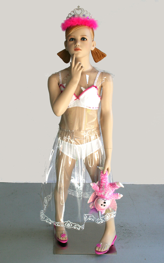
Daddy's Little Princess
Daddy's Little Princess at Casula Powerhouse Arts Centre by Linda Wilken opened a couple of weeks ago. If you remember, I first met Linda by chance at the Firstdraft Depot where she was undertaking a residency and I was working at the Big fag Press. We discovered we had some conceptual ideas in common and I interviewed her for Ivory Tower Magazine last year (page 10 in this document).
Here are some photos I took of Daddy's Little Princess.
.JPG)
.JPG)
.JPG)
.JPG)
.JPG)
.JPG)
.JPG)
.JPG)
.JPG)
.JPG)
.JPG)
Sexualisation and objectification of young girls is a current social and political issue. This exhibition represents the way young girls in contemporary western cultures develop their identity based on popular culture and stereotyping which begins in childhood. Influenced through magazines, music videos, social media and the internet, these ‘young consumers’ are being seduced into stylising themselves on hyper-sexualised ideals.-From the Casula Powerhouse website
Here are some photos I took of Daddy's Little Princess.
.JPG)
.JPG)
.JPG)
.JPG)
.JPG)
.JPG)
.JPG)
.JPG)
.JPG)
.JPG)
.JPG)
[All photos are mine of Linda Wilken's work at Casula Powerhouse Arts Centre]
Sunday, November 25, 2012
Francis Bacon AGNSW
Normally, I'm more a fan of the contemporary art side of things, but I don't pass up the chance to see complete collections of renowned artists' whom I've studied, when they're exhibited in Sydney for a short time.
Conceptually, I liked seeing the progression of Bacon's art to the events happening both in the world (such as the legalisation of homosexual sex), and in his life (such as the death of his lover). His paintings offered a window into his personality and struggles.
Many of his works were portraits of people he had strong relationships with, and some of his source material like photographs found in his studio really struck me.

 *2 images: Photographer John Deakin
Often, exhibitions inspire me in strange ways, and I find myself rushing home to start a new project of some kind. In this case, I dug out my old SLR camera and am currently planning on reminding myself how to load/develop/print film photos so that I can justify taking both my DSLR and my SLR with me on my trip to Vietnam early next year. It's been a very long time since I've done any portrait SLR work, and I just realised how much I missed it.
Conceptually, I liked seeing the progression of Bacon's art to the events happening both in the world (such as the legalisation of homosexual sex), and in his life (such as the death of his lover). His paintings offered a window into his personality and struggles.
Many of his works were portraits of people he had strong relationships with, and some of his source material like photographs found in his studio really struck me.


Often, exhibitions inspire me in strange ways, and I find myself rushing home to start a new project of some kind. In this case, I dug out my old SLR camera and am currently planning on reminding myself how to load/develop/print film photos so that I can justify taking both my DSLR and my SLR with me on my trip to Vietnam early next year. It's been a very long time since I've done any portrait SLR work, and I just realised how much I missed it.
Friday, September 21, 2012
PRINTING!!! (and web stuff)
I got my plates made up the other day at Imagination Graphics. I'm glad I checked everything as (LITERALLY) the last second because my QR codes didn't work!!! Thankfully I was able to fix them in time.
I spent the last two days printing, and got everything done. And let me tell you, 2 colour plates x 160 sheets on our press in 2 days, not to mention chopping them all in half and signing the limited edition of 12 - is not an easy feat!!!
Here's a bit of a documentation of the process:
Choosing my ink colour for the fountain (and making sure the middle mixes to a nice purple):

Putting the ink on the inking rollers:

Getting the plate all ready and properly dampened:

First print, colour no.1:

Day Two: Black Ink

Plate no. 2: Black plate

Sorting out some "too much water" issues:

Drying on print racks:

Sorting out some registration issues:
Chopping!

And some videos to explain the whole process (excuse the dodgy "self-camera" work)
*Images & videos all mine.
And that's the printing.
Website work has been a whole new world for me. I've never built a wordpress before and suddenly I've had to look up things like CSS codes. I think it's looking pretty good though! Don't you?
Thanks to Lucas Ihlein for all the help.
Friday, June 29, 2012
Linda Wilken
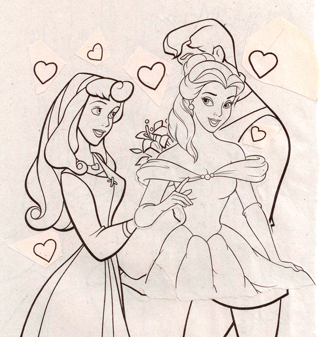
I went over to Firstdraft Depot last week (where the Big Fag Press is located), to give a speech to some artists in residence who might be interested in doing some prints. I also sat in on talks give by the artists about their work and was particularly interested in Linda Wilken who looks at the sexualisation of young girls, and subverting gender roles which society presents us with in many ways. She's currently using imagery from Disney in collage to encourage people to question what these stories we tell our children are really saying.


One of the points she looks at is also magazines aimed at teenagers like Dolly and Girlfriend, who inevitably get picked up by much younger girls. These magazines are filled with information about sex, makeup, fashion, etc, all which, when put in the context of innocent childhood, can be a little unnerving. This was interesting to me because I've been looking at how adult women are affected by magazines, but I've never given much thought to the fact that even child models are being photoshopped.
I've been in further contact with Linda, and I'm currently reading her honours thesis. I've arranged to interview her and use some of her work in my major project. It was very lucky for me because one of my other artist contributors pulled out.
*2 images: Linda Wilken
One of the points she looks at is also magazines aimed at teenagers like Dolly and Girlfriend, who inevitably get picked up by much younger girls. These magazines are filled with information about sex, makeup, fashion, etc, all which, when put in the context of innocent childhood, can be a little unnerving. This was interesting to me because I've been looking at how adult women are affected by magazines, but I've never given much thought to the fact that even child models are being photoshopped.
I've been in further contact with Linda, and I'm currently reading her honours thesis. I've arranged to interview her and use some of her work in my major project. It was very lucky for me because one of my other artist contributors pulled out.
Sunday, May 27, 2012
Art & About 2012
Art & About is holding a photography competition for its exhibition this year.
Sydney Life promotes contemporary photographic practices. The judges are looking for works that make an original and striking statement about Sydney life, images that will engage and intrigue the audience, invoke new perspectives and thoughts about Sydney lifestyle and culture.
Works should incorporate the photographer’s skill, individual concept and style to reveal a unique observation. You may portray any aspect of Sydney – an every day occurrence, an unusual or particular moment or place, the diversity of culture/s or subcultures, individual differences, celebrations or rituals, a natural or man made environment. We welcome work in a number of styles including documentary, portraiture and contemporary art.
I was thinking of entering some of my street photography. Fingers crossed I suppose!


Sunday, April 15, 2012
Trampoline Printing on the Big Fag Press
I'm writing this post without the intention to post it until after the Trampoline event on the 15th April 2012.
So basically I was approached through Lucas and the Big Fag Press by the people who run Trampoline, about designing and printing a flier for the event on the Press. Trampoline is a free art-like event where anyone can come along and give a 15 minutes speech about anything they think is "amazing".
For something roughly the size of an A5 piece of paper, this job would usually be sent to the Rizzeria or Blood and Thunder, but I agreed to take on the job to see a design through from concept to print as a practise for what I'll do for my major work.
I was given a basic outline and things I needed to include, so I came up with a design in three different shapes.


My "trapezoid" shape seemed to be the most resolved, so after a lot of back-and-forthing of emails, fonts and logos, and whether to include an exclamation mark, and how to spell "harbour" and many other things, my final design of the front ended up looking like this:
 I then created the map on the back which wasn't easy, perhaps my orienteering skills need a bit of work, but google maps is a very useful tool! I basically ended up tracing over screen prints of google maps and shifting it around to fit my design.
The next step in the Big Fag Press print process is to layout the design on a metal plate. This is done at Imagination Graphics, a place in Marrickville. The designs need to be converted to greyscale, as the ink in the end is what puts the colour on the paper. Ie, 100% black = 100% blue, 50% black (grey), = 50% blue (light blue).


I decided to put in some more time and save money by making one plate only and putting both the back and front of my design on the plate and turning the paper over to print on the back. This meant registration had to be worked out exactly, which I tried to do myself by mirroring the paper placement, designs and crop marks etc, all from one central line. As you can see the template gets very complex.

In the end, I didn't trust my layout enough, because although the "snap to" functions and guidelines in illustrator are awesome, Imagination Graphics just has mathematical software which can lay something this complex out easily. For simpler jobs, it wouldn't be difficult to do this myself, it's usually just a matter of making sure two plates for two different colours match up exactly with relevant registration marks.
This was my plate in the end: (the design looks blue just because where the design is etched out is always blue no matter what colour you want to print with)

I looked through a few different colours (oil based inks), and chose a warm-ish Cyan.


I then chose my paper, which was 690 x 750, 300gsm, coated, and printed several copies onto scrap paper just to test out where the central line would fall on the paper bed on our machine. It was then a matter of printing onto both sides of the paper and shifting the registration lines a couple of millimetres to make sure back and front would match. In the below image is Pat helping me use the sun to see if our registration was working properly.

I then printed all 50 copies, let them dry, and then printed the backs, all the time fighting to keep a balance of water vs. ink on the plate as it was a very humid day and the plate was drying up quickly.

At one point I had to clean the press blanket and start again because some flecks of paper began getting stuck to the blanket, and obscuring part of my design. This is the blanket below, it works as kind of a huge "stamp" taking ink from the plate to the paper.


And then became a tedious process of trimming the fliers, but they ended up coming out pretty well (at least I think so).

Pat, Diego and I are attending the Trampoline event on Sunday to give talk about the Big Fag Press - it works out nicely actually, because we do think it's pretty amazing!
*All images are mine.
So basically I was approached through Lucas and the Big Fag Press by the people who run Trampoline, about designing and printing a flier for the event on the Press. Trampoline is a free art-like event where anyone can come along and give a 15 minutes speech about anything they think is "amazing".
For something roughly the size of an A5 piece of paper, this job would usually be sent to the Rizzeria or Blood and Thunder, but I agreed to take on the job to see a design through from concept to print as a practise for what I'll do for my major work.
I was given a basic outline and things I needed to include, so I came up with a design in three different shapes.


My "trapezoid" shape seemed to be the most resolved, so after a lot of back-and-forthing of emails, fonts and logos, and whether to include an exclamation mark, and how to spell "harbour" and many other things, my final design of the front ended up looking like this:

The next step in the Big Fag Press print process is to layout the design on a metal plate. This is done at Imagination Graphics, a place in Marrickville. The designs need to be converted to greyscale, as the ink in the end is what puts the colour on the paper. Ie, 100% black = 100% blue, 50% black (grey), = 50% blue (light blue).


I decided to put in some more time and save money by making one plate only and putting both the back and front of my design on the plate and turning the paper over to print on the back. This meant registration had to be worked out exactly, which I tried to do myself by mirroring the paper placement, designs and crop marks etc, all from one central line. As you can see the template gets very complex.

In the end, I didn't trust my layout enough, because although the "snap to" functions and guidelines in illustrator are awesome, Imagination Graphics just has mathematical software which can lay something this complex out easily. For simpler jobs, it wouldn't be difficult to do this myself, it's usually just a matter of making sure two plates for two different colours match up exactly with relevant registration marks.
This was my plate in the end: (the design looks blue just because where the design is etched out is always blue no matter what colour you want to print with)

I looked through a few different colours (oil based inks), and chose a warm-ish Cyan.


I then chose my paper, which was 690 x 750, 300gsm, coated, and printed several copies onto scrap paper just to test out where the central line would fall on the paper bed on our machine. It was then a matter of printing onto both sides of the paper and shifting the registration lines a couple of millimetres to make sure back and front would match. In the below image is Pat helping me use the sun to see if our registration was working properly.

I then printed all 50 copies, let them dry, and then printed the backs, all the time fighting to keep a balance of water vs. ink on the plate as it was a very humid day and the plate was drying up quickly.

At one point I had to clean the press blanket and start again because some flecks of paper began getting stuck to the blanket, and obscuring part of my design. This is the blanket below, it works as kind of a huge "stamp" taking ink from the plate to the paper.


And then became a tedious process of trimming the fliers, but they ended up coming out pretty well (at least I think so).

Pat, Diego and I are attending the Trampoline event on Sunday to give talk about the Big Fag Press - it works out nicely actually, because we do think it's pretty amazing!
*All images are mine.
Thursday, April 12, 2012
Giopet's Graphic Art


And another caught my eye:

*All images thus far from Giopet's Graphic Art Blog.
The latter no doubt inspired by Phil Poynter's "I didn't recognise you with your clothes on", Dazed & Confused 1998:

Subscribe to:
Posts (Atom)