About Me
- Lou
- Sydney, NSW, Australia
- I'm an arts management worker/ artist/ designer. I work at Accessible Arts in administration and bookkeeping, but also work on various freelance activities from photography to graphic design. I'm Associate Partner at the ARI, the Big Fag Press, board member of Runway Australian Experimental Art and occasionally work at Bailey and Yang Consultants. My creative work has often been driven by social issues and commentary. This blog started as a way of documenting research for my honours year at uni, which I have continued, in order to gather inspiration for future artistic practice.
Showing posts with label Professional Practice. Show all posts
Showing posts with label Professional Practice. Show all posts
Monday, July 30, 2012
I finally created a profile on Pinterest. It's a lot of fun, I've discovered, and great for inspiration and mood boards.

Saturday, June 2, 2012
SurveyMonkey thoughts
I've been reading through my 44 SurveyMonkey responses. Some of the answers have been really thought-provoking. About 80% of people who answered my survey described themselves in general as "informed consumers", which is great - that's pretty much the target market I was looking for. In retrospect I would have not titled the survey as "fashion", because I think a few people answered "no" as they are not informed consumers of fashion.
Consumers feel strongly about topics across a wide spectrum of issues - political, environmental, religious, culture, technological and social. Some specific issues brought up were: gender equality, gay rights, fair trade, design authenticity, poverty, health, secularism of ethics, "slow" design, renewable resources, sustainable town planning & city building, the banning of smoking in public, support of local & organic produce, anti-animal testing, anti- mass productions, and waste/ landfill ethics. The most prominent issue for my survey responders was environmental sustainability and fair trade. 7% of my responders did not answer the question.
70% of my responders avoid shopping at specific stores or buying specific products because of moral/ ethical issues. Stores include: Max Brenner, Fast Fashion Chains, McDonalds, BP, Woolworths/ Coles, Nike, Starbucks, Gloria Jeans, Cotton On, Nestle, Proctor & Gamble, Zara, Bayer Pharmaceuticals, Shell, City Beach, Mossimo, YD, Amazon and Portmans. Products include: Non-organic skin/ beauty products, products made in China, non-organic foods, non-Australian made products, products which use palm oil, cheap fashion, fur products, products tested on animals, caged eggs, large coffee chains, "adult" products.
Responders said they shop at a huge variety of stores. There were responses rangeing from discount stores like hot dollar, zara, topshop, kmart & supre, chain stores like sportsgirl, portmans, jay jays, witchery and general pants, designerwear like gorman, sass& bide, allanah hill, miu miu, mimco, and some higher fashion stores like chanel, prada and bally. There was also a number of people who said they shopped at local boutiques, and well as online stores like etsy.
Magazines of responders included Frankie, Cleo, Russh, W, Numero, Oyster, Harper's Bazaar, Vogue, Lula, Dazed & Confused, OK, Grazia, Shop Til You Drop, Wallpaper, ID and Madison. Other publications: SMH, Daily Telegraph, BBC online, ABC online, the Australian, Monocle, the Guardian, New York Times online, New Scientist, Reddit, MX, and Sunday magazine. Blogs include: TheyAllHateUS, amandpalmer, showstudio, and design milk blog.
I then tried to gain an understanding of my consumers by looking at the way they make decisions. I separated answers into 4 categories: "humanist", "indecisive", "safe" and "personal". So, for example buying a present for a friend, giftcard would be the "indecisive" option, jewellery would be the "safe" option, something at the oxfam store would be "humanist" and taking her out to lunch would be "personal". In retrospect, I'm not sure these answers worked the way I wanted them to. The response for my movie choice one, for example "A Comedy because there's an actor in it who was funny in some other movie so you think it'll probably be okay" was my "safe" option, but I'm not sure it really determined attitudes, people may have simply chosen it because they like comedies.
I think the most interesting answers came from my question about definitions of beauty and weather society's ideals match what people's ideals are. Every single person who answered the question (34 responses) said they largely disagreed with societal/ media repsresentations of beauty, or that they were influenced by them and wish they weren't. There were many responses who said they recognised beauty in confidence and personality: "inner beauty", and beauty in people who were unique and different. It is therefore so surprising that media strays so far from consumer demands. It is possible, also, that some people shaped their responses based on social desirability, ie what they "should" say in reponse to such a question. But I think that largely the reponses were truthful.
45% of reponders said they did consider or strongly consider a product to have more monetary value if it is ethical/ sustainable/ fair trade/ funding charities/ protesting against malpractice/ etc. 56% said it did sometimes, and only 7% said it didn't. Examples of products people pay more for are: local food produce, fair trade coffee, free range eggs, oxfam toys, underwear made in Australia, organic products, hand made clothing, lush cosmetics, Trilogy products, organic materials & cotton, authenticity of design, vintage clothes, charity products, and non-mass produced products.
Thursday, May 31, 2012
Media & Promotion
We had a lecture & tute today by Kate Vandermeer about different fashion career options and some psychometric testing. It's refreshing to know there's many options in the fashion/ creative industry and that often people don't end up where they thought they would, and that that's okay. Actually I'm surprised more people in my class didn't say they wanted to be buyers - I have a friend from Raffles who is absolutely desperate to be a fashion buyer. Then again, buying must be a hard job to find - who would give up getting paid for travelling and "shopping"?
The question of what I'm going to do next year is an interesting one. I am trying to self promote a little. Kate was talking about a foot in the door, and I think in a few little ways I have done that with the Big Fag Press and some photography. I have some photos of the Green Bans Art Walks coming out in June Art Monthly soon. I'm just not sure that photography's the way I want to go. To be honest I don't have a good ability to be objective about any of my work. I know that's actually a skill that you pick up somewhere along the way, but I think I can be heavily critical, and sometimes very afraid of EVERYTHING there is to learn in any particular field. I have this idea that a professional knows everything there is to know about something - but that's not always the case, especially not with creative people. If you know everything, you can't create anything new & original, right?
I think my psychometric test was more or less accurate. I am flexible, creative, autonomous and I do have a natural tendancy to try and manage other people (in part-time work, interning, etc). I thought about it a bit, and I think I now agree also that in a business sense I can be quite extroverted. The answer about me being a rationalist rather than a humanist was incorrect though, and my boyfriend agrees (and he knows me better than anyone). And I am definitely a planner - just not an effective one! (which I can probably work on). My two downfalls I suppose are a lack of initiative and determination towards business, and I think that comes from that sense of insecurity where if risks are being taken, I prefer them not to be on my shoulders.
I have an ABN, so I suppose I have a "business", but it kind of developed by itself, it is in no way my main source of income and I'm not sure how far I want to take it, or if I can manipulate it into being something extraordinary or original. My business was just a means of being paid for some work for tax purposes.
I do think some of the things Kate talked about apply to me though. I think what she said about keeping in touch with creative people and contacts, is really valuable. I know so many artists and photographers that I really should keep in regular contact. You never know when someone is going to have a skill or an idea that could help you. I just contacted a friend I haven't seen in ages, Berry Mak, (he's a wedding photographer). I need to ask him some basic questions about charging for photography jobs, file types and backing up work, etc. But I might also talk to him about my photoshoot ideas because bouncing my ideas off others is incredibly valuable to me. I'm not sure I'd have any ideas at all if I didn't voice them to other people.
As far as self promotion goes, I set up a profile on The Loop a while ago, and I've been adding projects slowly. Today I signed up for Pinterest because from what I've seen it's such an awesome tool to collate visual ideas, and especially mood boards for projects. I've also resurrected my twitter account, but to be honest I don't have an intuitive understanding of twitter like I do facebook. Maybe I should get someone to explain it. I also need to look into LinkedIn and Instagram, not to mention trying to link all these together and at the same time keep my private facebook page, well, private! The whole social media thing can feel a little overwhelming at times, I mean, trying to keep up with so many people and update so many things could be a full time unpaid job in itself! I do mean to keep up this blog throughout this year and beyond, though I like the idea also of having a separate blog just for photography.
Speaking of insecurities, I have a photoshoot with a friend of mine planned for Monday. For some reason I'm terrified I'll have forgotten how to use a camera overnight...
Sunday, May 27, 2012
Art & About 2012
Art & About is holding a photography competition for its exhibition this year.
Sydney Life promotes contemporary photographic practices. The judges are looking for works that make an original and striking statement about Sydney life, images that will engage and intrigue the audience, invoke new perspectives and thoughts about Sydney lifestyle and culture.
Works should incorporate the photographer’s skill, individual concept and style to reveal a unique observation. You may portray any aspect of Sydney – an every day occurrence, an unusual or particular moment or place, the diversity of culture/s or subcultures, individual differences, celebrations or rituals, a natural or man made environment. We welcome work in a number of styles including documentary, portraiture and contemporary art.
I was thinking of entering some of my street photography. Fingers crossed I suppose!


Thursday, May 24, 2012
Survey Monkey!
I've just started customer profiling by asking a few detailed questions relating to the psychographics of my customers on my SurveyMonkey.
Semi- Permanent Sydney 2012
I went to the Semi-Permanent, Sydney 2012 conference a few days ago, which was well worth the money in the ideas and inspiration that it gave me. I always take a lot away from hearing about projects other people are doing.
Here are the talks which stood out most to me:
Kelli Anderson is an American graphic designer who had a number of extremely interesting works to show us including moving images called kinographics, and paper that can play music. Two of her works stood out to me as being relevant to my project. The first was her collaboration with the Yes Men, and their 2008 hoax New York Times newspaper.

This fabulously copied counterfeit newspaper presented a blueprint for a Utopian future, from Maximum Wage Laws and the end of the Iraq war to ads for where to trade in your car for a bicycle. Here are some of the reactions from people on the street:
Unfortunately the hoax NY times website doesn't seem to be working anymore. This fantastic piece of satire and verisimilitude reminds me of the Onion, except the latter is usually about getting a horrified reaction to terrifying fake news such as "New Law Requires Women to Name Baby, Paint Nursery before getting Abortion", while the Yes Men wanted people to wish that their Utopian newspaper was real.
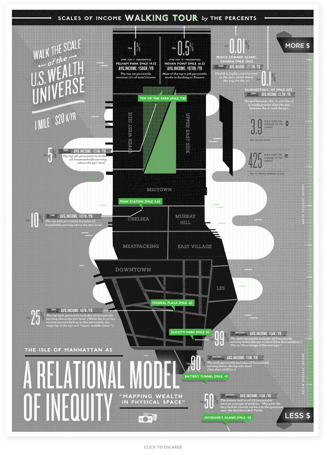
Kelli also does a lot of Infographics, including this Relational Model of Inequity which is a rather clever way to illustrate the inequity of wage differences in the US. In this map she mathematically works out the relativity of income brackets to a walking tour of New York city. In relative terms, to walk the distance of the top 0.01% of income earners, you would have to walk all the way through to the top of Canada or something ridiculous.
Since I've had lots of practise drawing maps for the Big Fag Press, I thought I could create a walking tour of Sydney looking at Sustainability figures.
Kelli has a lot of TED talks which are fairly inspirational also.
David Alan Harvey is a photographer and editor of Burn magazine, an online magazine which showcases the work of emerging photographers. I'm planning on submitting my work to Burn, and maybe next year applying for his Emerging Photographer Fund. David is currently working on a book collating his photography in Brazil, the layout of the book is extremely interesting - it is unbinded and allows for images to be moved around, and viewed juxtaposed next to each other in various ways. I loved his approach to portrait photograph - no fear, just the ability to be friendly, natural and get people to trust you.
Derek Henderson is also a portrait photographer, and has worked for many fashion magazines. What I loved about his work was the fact that he is an amazing professional photographer, and yet, like me, he doesn't do much studio lighting. He prefers ambient light, or if it has to be a studio, then just a single light to imitate daylight. He also minimises the retouching on his photographs and tries to portray true emotion. I was inspired by the lighting in these photographs:


The Monkeys intrigued me because I'm really interested in the changing nature of advertising in the last few years, which I think has been driven by the rise of social media platforms. This is stuff like names on coke bottles - promotional material that is passed from screen to screen of users through generating individual interest in the product. This is kind of what The Monkeys do - it's kind of like guerilla advertising. They wanted to advertise Ice Break (the drink), and decided fulfill every guy's fantasy - attach a motor to random objects like a couch, break some world records and end up on the news around the country.
The Semi-Permanent publication was also interesting and I may have found some potential contributors such as:
Alyson Pearson (possible commissioned work: graphics over photography), James McLaughlin (possible digital photography manipulation help), and Daniel Caballero and Rebecca Murphy (both have artworks looking at the theme of fashion and death).
Here are the talks which stood out most to me:
Kelli Anderson is an American graphic designer who had a number of extremely interesting works to show us including moving images called kinographics, and paper that can play music. Two of her works stood out to me as being relevant to my project. The first was her collaboration with the Yes Men, and their 2008 hoax New York Times newspaper.
*Image: the Yes Men
This fabulously copied counterfeit newspaper presented a blueprint for a Utopian future, from Maximum Wage Laws and the end of the Iraq war to ads for where to trade in your car for a bicycle. Here are some of the reactions from people on the street:
Unfortunately the hoax NY times website doesn't seem to be working anymore. This fantastic piece of satire and verisimilitude reminds me of the Onion, except the latter is usually about getting a horrified reaction to terrifying fake news such as "New Law Requires Women to Name Baby, Paint Nursery before getting Abortion", while the Yes Men wanted people to wish that their Utopian newspaper was real.
Kelli also does a lot of Infographics, including this Relational Model of Inequity which is a rather clever way to illustrate the inequity of wage differences in the US. In this map she mathematically works out the relativity of income brackets to a walking tour of New York city. In relative terms, to walk the distance of the top 0.01% of income earners, you would have to walk all the way through to the top of Canada or something ridiculous.
Image: Kelli Anderson
Since I've had lots of practise drawing maps for the Big Fag Press, I thought I could create a walking tour of Sydney looking at Sustainability figures.
Kelli has a lot of TED talks which are fairly inspirational also.
David Alan Harvey is a photographer and editor of Burn magazine, an online magazine which showcases the work of emerging photographers. I'm planning on submitting my work to Burn, and maybe next year applying for his Emerging Photographer Fund. David is currently working on a book collating his photography in Brazil, the layout of the book is extremely interesting - it is unbinded and allows for images to be moved around, and viewed juxtaposed next to each other in various ways. I loved his approach to portrait photograph - no fear, just the ability to be friendly, natural and get people to trust you.
Derek Henderson is also a portrait photographer, and has worked for many fashion magazines. What I loved about his work was the fact that he is an amazing professional photographer, and yet, like me, he doesn't do much studio lighting. He prefers ambient light, or if it has to be a studio, then just a single light to imitate daylight. He also minimises the retouching on his photographs and tries to portray true emotion. I was inspired by the lighting in these photographs:
*2 images: Derek Henderson
The Monkeys intrigued me because I'm really interested in the changing nature of advertising in the last few years, which I think has been driven by the rise of social media platforms. This is stuff like names on coke bottles - promotional material that is passed from screen to screen of users through generating individual interest in the product. This is kind of what The Monkeys do - it's kind of like guerilla advertising. They wanted to advertise Ice Break (the drink), and decided fulfill every guy's fantasy - attach a motor to random objects like a couch, break some world records and end up on the news around the country.
The Semi-Permanent publication was also interesting and I may have found some potential contributors such as:
Alyson Pearson (possible commissioned work: graphics over photography), James McLaughlin (possible digital photography manipulation help), and Daniel Caballero and Rebecca Murphy (both have artworks looking at the theme of fashion and death).
Wednesday, May 16, 2012
Editorial Philosophy
My "evolving" editorial philosophy:
Editorial Philosophy
"The best way to predict the
future is to create it" – Peter
Drucker.
LookUp (working title)’s philosophy centres around the idea of
sustainability. In environmental terms, sustainability means using the
resources of today while ensuring not to detract from the needs of the future.
LookUp extends the use of the word
sustainability by applying it to any world issue. For example, sustainability
as applied to consumerism may allude to the idea that the contemporary society
is not balancing its need for material wealth with a seemingly forgotten need
for the happiness within. LookUp is
about reclaiming the true essence of design: creating an object that solves a
problem or rectifies a societal need; a feature that can be said is missing
from much contemporary design, especially in fashion.
Business Placement
LookUp provides what no other fashion/ lifestyle magazine provides: a second
dimension. LookUp does not aim to
sell garments, epitomise the beauty of the latest fashion styles, or convey the
latest celebrity intrigue, to the public. LookUp combines the love of amateur craft such as Frankie, the environmental concerns of Peppermint, the parody of Adbusters,
the format subversion of Is Not Magazine,
the satire of Zoolander, I Hurt I am in Fashion and the Onion, and the Utopian future ideas in Kelli Anderson and the Yes Men’s hoax New York Times in 2008.
Target Market
In contrast to the
Fashion/ Lifestyle magazines of today whose Target Market is always a fairly
specific age group and gender, LookUp
prefers to look beyond age and other less meaningful demographics and reaches
out more to a group of people who share in the philosophy that the only thing
standing between the world we have and the world that could be is the dream of
making it so. LookUp embodies the
quote of Peter Drucker, a creation aspiring to be future by design.
Objectivity
The objective through
the definition of LookUp’s philosophy
is to reach out to a society which is not always aiming to attain a sustainable
future. Through its target market, it endeavours to encourage critical thought
and activism and, through consumer demand, eventually force creative business
to change its own philosophies.
Content
LookUp will achieve its objectives through a series of creative
endeavours and collaborations that seek to encourage critical thought and
provide visions of the world we could have. The content will be
intellectual and largely based on theory, and many parts will involve the technique of satire. Imagery will
be largely artistic and conceptual, while written pieces will be closer to
literary works, rather than journalism. Advertisements will be exclusively hoax
ads/ spoof ads/ or serious ads only from business/ companies who parallel LookUp’s vision. The publication will
include basic things one might expect to find in a magazine such as horoscopes
and crosswords, however these will be deconstructed either through parody, or
changing their essential uses. LookUp
will also include photography and art that returns to its most basic forms:
displaying the beauty of raw practice and creative talent, as well as
showcasing the older practices of lithographic printing.
Outcome
LookUp is not just a “magazine”, it is also about confronting the very
definition of “magazine”. It publishes two poster magazines as street art each
year with the aim of encouraging user input on the theme, running alongside its
online forum, all of which is documented and included in the annual
publication. LookUp ensures its
practices adhere to its own philosophy including fair trade, use of sustainable
resources, and encompassing forgotten practices of printing by its relations
with the Big Fag Press team.
Topicality
The theme of Issue 1 is
Fashion, specifically looking at psychological sustainability with regards to
self-image, and how this is situated in the realms of body image issues,
practice within fashion systems, the ideal body and self esteem.
It draws on Plato’s
theory of forms which looks at the concept of a perfect form that exists
outside of reality. (Plato Symposium 210E) For example beauty has a
perfect form that we aspire to. The fashion industry constantly provides us
with a fantasy world through catwalks, advertising, and imagery, and I am
concerned with society’s lack of ability to critically separate this fantasy
from reality (Franklin 2010).
LookUp’s philosophy aims to create a fantasy
of its own, which is a world that operates prioritising what ethically and
morally would make a better world. This issue is therefore aimed at consumers
of fashion with the capacity to critically analyse the difference between
reality and fashion’s ideal form as well as change consumer demand and
ultimately reach the fashion industry in order to instigate practices which fit
within LookUp’s better world.
Business Structure
LookUp is not-for-profit, independently published, and relies on grants
through promotion of charity organisations. LookUp publishes limited edition copies of its magazine and Street Art
Posters, which can be purchased online. Money from sales pays for printing, and
splits the rest among contributors.
Wednesday, May 2, 2012
Opportunities for Emerging Designers
In researching various Australian emerging designers and competitions. I've come across a few people I may even contact to ask if I can use their work in my media project.
I really loved some of Natalie Perkins' work.


*2 images from Natalie's website.
I've also become quite excited about entering the Design NSW Travelling Art Scholarship - it seems like a really fantastic opportunity. I also want to enter World Nomads Travel Photography Scholarship, which my friend Anna Zhu won in 2010. The photography from her travels to Antarctica are amazing.
I really loved some of Natalie Perkins' work.
*2 images from Natalie's website.
I've also become quite excited about entering the Design NSW Travelling Art Scholarship - it seems like a really fantastic opportunity. I also want to enter World Nomads Travel Photography Scholarship, which my friend Anna Zhu won in 2010. The photography from her travels to Antarctica are amazing.
Brand Identity Research - Gorman Bondi

I did some brand identity research at Gorman Bondi Junction. The atmosphere was really friendly and welcoming with lots of colour. It seemed like a young, flirtateous store that I would be inclined to go into, unlike the Chanel next door where I would probably feel like Julia Roberts in Pretty Woman.
There was a strong sense that the creatives behind this store were selling something beyond clothes - the belief that fashion should respect the environment that essentially creates textiles.
The furniture gave a sense of homeliness, and the stock all seemed to be vintage-like. I loved the small touches like the hanging coloured umbrellas, and later on the facebook page I learnt about a competition to win leopard print vintage bikes - oh how badly I want one now!


*All photographs are mine.
Sunday, April 15, 2012
Trampoline Printing on the Big Fag Press
I'm writing this post without the intention to post it until after the Trampoline event on the 15th April 2012.
So basically I was approached through Lucas and the Big Fag Press by the people who run Trampoline, about designing and printing a flier for the event on the Press. Trampoline is a free art-like event where anyone can come along and give a 15 minutes speech about anything they think is "amazing".
For something roughly the size of an A5 piece of paper, this job would usually be sent to the Rizzeria or Blood and Thunder, but I agreed to take on the job to see a design through from concept to print as a practise for what I'll do for my major work.
I was given a basic outline and things I needed to include, so I came up with a design in three different shapes.


My "trapezoid" shape seemed to be the most resolved, so after a lot of back-and-forthing of emails, fonts and logos, and whether to include an exclamation mark, and how to spell "harbour" and many other things, my final design of the front ended up looking like this:
 I then created the map on the back which wasn't easy, perhaps my orienteering skills need a bit of work, but google maps is a very useful tool! I basically ended up tracing over screen prints of google maps and shifting it around to fit my design.
The next step in the Big Fag Press print process is to layout the design on a metal plate. This is done at Imagination Graphics, a place in Marrickville. The designs need to be converted to greyscale, as the ink in the end is what puts the colour on the paper. Ie, 100% black = 100% blue, 50% black (grey), = 50% blue (light blue).


I decided to put in some more time and save money by making one plate only and putting both the back and front of my design on the plate and turning the paper over to print on the back. This meant registration had to be worked out exactly, which I tried to do myself by mirroring the paper placement, designs and crop marks etc, all from one central line. As you can see the template gets very complex.

In the end, I didn't trust my layout enough, because although the "snap to" functions and guidelines in illustrator are awesome, Imagination Graphics just has mathematical software which can lay something this complex out easily. For simpler jobs, it wouldn't be difficult to do this myself, it's usually just a matter of making sure two plates for two different colours match up exactly with relevant registration marks.
This was my plate in the end: (the design looks blue just because where the design is etched out is always blue no matter what colour you want to print with)

I looked through a few different colours (oil based inks), and chose a warm-ish Cyan.


I then chose my paper, which was 690 x 750, 300gsm, coated, and printed several copies onto scrap paper just to test out where the central line would fall on the paper bed on our machine. It was then a matter of printing onto both sides of the paper and shifting the registration lines a couple of millimetres to make sure back and front would match. In the below image is Pat helping me use the sun to see if our registration was working properly.

I then printed all 50 copies, let them dry, and then printed the backs, all the time fighting to keep a balance of water vs. ink on the plate as it was a very humid day and the plate was drying up quickly.

At one point I had to clean the press blanket and start again because some flecks of paper began getting stuck to the blanket, and obscuring part of my design. This is the blanket below, it works as kind of a huge "stamp" taking ink from the plate to the paper.


And then became a tedious process of trimming the fliers, but they ended up coming out pretty well (at least I think so).

Pat, Diego and I are attending the Trampoline event on Sunday to give talk about the Big Fag Press - it works out nicely actually, because we do think it's pretty amazing!
*All images are mine.
So basically I was approached through Lucas and the Big Fag Press by the people who run Trampoline, about designing and printing a flier for the event on the Press. Trampoline is a free art-like event where anyone can come along and give a 15 minutes speech about anything they think is "amazing".
For something roughly the size of an A5 piece of paper, this job would usually be sent to the Rizzeria or Blood and Thunder, but I agreed to take on the job to see a design through from concept to print as a practise for what I'll do for my major work.
I was given a basic outline and things I needed to include, so I came up with a design in three different shapes.


My "trapezoid" shape seemed to be the most resolved, so after a lot of back-and-forthing of emails, fonts and logos, and whether to include an exclamation mark, and how to spell "harbour" and many other things, my final design of the front ended up looking like this:

The next step in the Big Fag Press print process is to layout the design on a metal plate. This is done at Imagination Graphics, a place in Marrickville. The designs need to be converted to greyscale, as the ink in the end is what puts the colour on the paper. Ie, 100% black = 100% blue, 50% black (grey), = 50% blue (light blue).


I decided to put in some more time and save money by making one plate only and putting both the back and front of my design on the plate and turning the paper over to print on the back. This meant registration had to be worked out exactly, which I tried to do myself by mirroring the paper placement, designs and crop marks etc, all from one central line. As you can see the template gets very complex.

In the end, I didn't trust my layout enough, because although the "snap to" functions and guidelines in illustrator are awesome, Imagination Graphics just has mathematical software which can lay something this complex out easily. For simpler jobs, it wouldn't be difficult to do this myself, it's usually just a matter of making sure two plates for two different colours match up exactly with relevant registration marks.
This was my plate in the end: (the design looks blue just because where the design is etched out is always blue no matter what colour you want to print with)

I looked through a few different colours (oil based inks), and chose a warm-ish Cyan.


I then chose my paper, which was 690 x 750, 300gsm, coated, and printed several copies onto scrap paper just to test out where the central line would fall on the paper bed on our machine. It was then a matter of printing onto both sides of the paper and shifting the registration lines a couple of millimetres to make sure back and front would match. In the below image is Pat helping me use the sun to see if our registration was working properly.

I then printed all 50 copies, let them dry, and then printed the backs, all the time fighting to keep a balance of water vs. ink on the plate as it was a very humid day and the plate was drying up quickly.

At one point I had to clean the press blanket and start again because some flecks of paper began getting stuck to the blanket, and obscuring part of my design. This is the blanket below, it works as kind of a huge "stamp" taking ink from the plate to the paper.


And then became a tedious process of trimming the fliers, but they ended up coming out pretty well (at least I think so).

Pat, Diego and I are attending the Trampoline event on Sunday to give talk about the Big Fag Press - it works out nicely actually, because we do think it's pretty amazing!
*All images are mine.
Subscribe to:
Posts (Atom)